
如何解决Android 可绘制工具提示箭头框
我尝试了下面的代码来创建一个弹出窗口,顶部有一个类似工具提示的箭头。附上图片。
但结果我得到了一些不同的东西。
弹出式充气机:
LayoutInflater inflater = (LayoutInflater)
                        getApplicationContext().getSystemService(Context.LAYOUT_INFLATER_SERVICE);
              View  view = inflater.inflate(R.layout.popup,null);
              mypopupWindow = new PopupWindow(view,500,RelativeLayout.LayoutParams.WRAP_CONTENT,true);
              mypopupWindow.setBackgroundDrawable(new ColorDrawable(Color.WHITE));
              mypopupWindow.showAsDropDown(v,-153,0);
弹出式布局:
<?xml version="1.0" encoding="utf-8"?>
<RelativeLayout xmlns:android="http://schemas.android.com/apk/res/android"
    android:layout_width="match_parent"
    android:layout_height="wrap_content">
<LinearLayout
        android:layout_width="match_parent"
        android:layout_height="wrap_content"
        android:padding="50dp"
        android:layout_marginTop="50dp"
        android:background="@drawable/shadow_recta"
        android:orientation="vertical"
        android:gravity="center">
     <TextView
            android:layout_width="match_parent"
            android:layout_height="wrap_content"
            android:layout_marginTop="20dp"
            android:text="text long text" />
        <Button
            android:layout_width="match_parent"
            android:layout_height="wrap_content"
            android:text="Button"/>
</LinearLayout>
可绘制文件:
<?xml version="1.0" encoding="utf-8"?>
<layer-list xmlns:android="http://schemas.android.com/apk/res/android">
    <item android:gravity="top|center_horizontal" >
        <rotate android:fromdegrees="0" android:todegrees="-45"
            android:pivotX="0%" android:pivotY="50%" >
            <shape android:shape="rectangle">
                <size android:width="24dp" android:height="24dp" />
                <stroke android:color="@android:color/holo_blue_bright" android:width="1dp"/>
            </shape>
        </rotate>
    </item>
    <item>
        <shape android:shape="rectangle">
            <size android:width="206dp" android:height="76dp" />
            <solid android:color="@android:color/white" />
            <stroke android:color="@android:color/holo_blue_bright"  android:width="1dp"/>
            <corners android:radius="2dp" />
        </shape>
    </item>

    <item android:gravity="top|center_horizontal">
        <rotate
            android:layout_width="match_parent"
            android:layout_height="match_parent"
            android:fromdegrees="-45"
            android:pivotX="-50%"
            android:pivotY="60%"
            android:todegrees="35">
            <shape android:shape="rectangle">
                <solid android:color="@android:color/white" />
                <size
                    android:width="24dp"
                    android:height="24dp" />
                <stroke
                    android:width="1dp"
                    android:color="@android:color/holo_blue_bright" />
            </shape>
        </rotate>
    </item>
</layer-list>
预期图像:

我得到的输出:

请帮助我按照预期的图像创建一个框。
解决方法
这并不难,关键是三个layer-list Drawable:
-
工具提示(三角形)必须是固定大小。
-
背景不能是固定大小,因为内容大小未知。
-
调整边距和内边距(在
Drawable内)。
1.创建 layer-list Drawable:
<layer-list
    xmlns:android="http://schemas.android.com/apk/res/android">

    <item                      //background part
        android:top="17dp">    //margin top,half of the 【rotated】 rectangle height

        <shape
            android:shape="rectangle">

            <solid
                android:color="@color/purple_200" />

            <corners
                android:radius="8dp" />

            <padding                    //important part
                android:top="17dp" />   //offset the margin top,shows up the tooltip perfectly

        </shape>

    </item>

    <item                       //tooltip part
        android:width="24dp"    //size must be fixed
        android:height="24dp"
        android:end="32dp"     //margin end (right)
        android:gravity="end"  //place wherever you want
        android:top="-12dp">   //margin top,negative half of its height,display half of this rotated rectangle

        <rotate
            android:fromDegrees="45">

            <shape
                android:shape="rectangle">

                <solid
                    android:color="@color/purple_500" />    //change back to background part color after your experiment and testing

            </shape>

        </rotate>

    </item>

</layer-list>
2.适用于View:
<TextView
    android:layout_width="wrap_content"
    android:layout_height="wrap_content"
    android:text="Hi,I'm Sam"
    android:textColor="@color/black"
    android:textSize="40sp"
    android:background="@drawable/chat_background"    //here
    android:paddingHorizontal="16dp"/>                //apply padding bottom in Drawable,not in here

<TextView                                             //just for comparison
    android:layout_width="wrap_content"
    android:layout_height="wrap_content"
    android:layout_marginTop="16dp"
    android:text="Hi,I'm Sam"
    android:textColor="@color/black"
    android:textSize="40sp"
    android:background="@color/purple_200"
    android:paddingHorizontal="16dp"/>
结果:
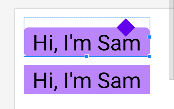
小数学:
- 未旋转的矩形高度为
24dp。 - 旋转的矩形高度为
square root of (24^2)*2 = 33.9411。 - 旋转矩形高度的一半是
16.9706,所以我们取17。
应用垂直填充的提示:
-
修改背景部分的填充顶部(例如:
17dp + 8dp = 25dp)。 -
修改工具提示(旋转矩形)部分的顶部边距以抵消(例如:
-12dp - 8dp = -20dp)。
这是您的要求:
- 描边样式
- 仅显示箭头顶部
1.将我的示例答案从纯色样式更改为笔触样式:
-
同时应用于背景部分和工具提示部分。
<stroke android:color="@color/purple_200" android:width="2dp"/> //border thickness,keep this in mind <solid android:color="@color/white" /> //white background color,must have -
现在您注意到旋转矩形的下半部分也显示出来了,如何隐藏它?嗯,我们的想法是制作一些东西来覆盖/覆盖 - 但不是完全的。我们还需要一层。
2.复制工具提示部分,使其成为第三层,我们只需将其向下移动 border width + 1dp = 3dp 的距离,并赋予其纯白色背景色:
<item
    android:width="24dp"
    android:height="24dp"
    android:end="32dp"
    android:gravity="end"
    android:top="-9dp">    //here,-12 + 3 = -9

    <rotate
        android:fromDegrees="45">

        <shape
            android:shape="rectangle">

            <solid
                android:color="@color/purple_500" />    //change back to white after your testing

        </shape>

    </rotate>

</item>
结果:


版权声明:本文内容由互联网用户自发贡献,该文观点与技术仅代表作者本人。本站仅提供信息存储空间服务,不拥有所有权,不承担相关法律责任。如发现本站有涉嫌侵权/违法违规的内容, 请发送邮件至 dio@foxmail.com 举报,一经查实,本站将立刻删除。