

如何解决如何将微调器下拉菜单与微调器居中对齐
我需要像那样制作下拉弹出窗口。 我需要帮助 -
- 弹出窗口的垂直和水平位置不会改变
- 如何获得这些圆角。
- 弹出项文本不会居中对齐
解决方法
要实现上述要求,您可以使用具有自定义样式的 Material Drop Down Menu,该样式继承自 Widget.MaterialComponents.TextInputLayout.OutlinedBox.ExposedDropdownMenu 的父级。
1)首先,您必须使用自定义样式在您的 xml 布局中声明此材质下拉菜单,如下所示。请注意,使用属性:android:dropDownHorizontalOffset="0dp" 或 android:dropDownVerticalOffset="10dp" 您可以垂直/水平移动弹出菜单,并使用特定的 dp价值。
<com.google.android.material.textfield.TextInputLayout
        android:id="@+id/dropDownTextInputLayout"
        style="@style/MyExposedDropdownMenu"
        android:layout_width="wrap_content"
        android:layout_height="wrap_content">

        <com.google.android.material.textfield.MaterialAutoCompleteTextView
            android:id="@+id/autoCompleteTextView"
            android:layout_width="160dp"
            android:layout_height="70dp"
            android:ellipsize="end"
            android:focusable="false"
            android:maxLines="1"
            android:gravity="center"
            android:dropDownHorizontalOffset="0dp"
            android:dropDownVerticalOffset="10dp"
            android:dropDownWidth="160dp"
            android:dropDownHeight="wrap_content"
            android:textColor="@color/white"
            android:inputType="none"
            android:singleLine="true"/>

    </com.google.android.material.textfield.TextInputLayout>
其中@style/MyExposedDropdownMenu 是您的自定义样式,如下所示。在这种样式中,关键点是我们从父级 OutlinedBox.ExposedDropdownMenu 继承并覆盖 boxBackgroundColor 以更改 TextInputLayout 下拉框颜色和自定义 shapeAppearance 您可以在其中更改 TextInputLayout 的角半径。
    <style name="MyExposedDropdownMenu" parent="Widget.MaterialComponents.TextInputLayout.OutlinedBox.ExposedDropdownMenu">
        <item name="boxBackgroundColor">@android:color/black</item>
        <item name="shapeAppearance">@style/ShapeAppearance.App.SmallComponent</item>
        <item name="hintTextColor">@android:color/white</item>
        <item name="endIconTint">@android:color/white</item>
    </style>


    <style name="ShapeAppearance.App.SmallComponent" parent="ShapeAppearance.MaterialComponents.SmallComponent">
        <item name="cornerSize">50dp</item>
    </style>
2) 要使下拉列表中的每个项目都具有圆角,您可以使用具有属性 CornerFamily.ROUNDED 和属性的自定义 ShapeAppearanceModel 以编程方式实现此目的以像素为单位的舍入值。最后,要对齐 Center 中的每个项目,您必须使用 android:textAlignment="center" 进行自定义布局,并将此自定义布局项目传递到您的适配器中。 下面是如何在代码中实现上述任务:
//your data
String[] items  = {"1","2","3","4","5","6","7","8","9","10"};

//get your MaterialAutoCompleteTextView
MaterialAutoCompleteTextView mAutoCompleteTV = findViewById(R.id.autoCompleteTextView);

//initialize your adapter with a custom list item layout
ArrayAdapter<String> adapter = new ArrayAdapter<String>(this,R.layout.custom_drop_down_item,items);

//create your custom ShapeAppearanceModel for your Drop Down Item
ShapeAppearanceModel shapeAppearanceModel = new ShapeAppearanceModel()
        .toBuilder()
        .setAllCorners(CornerFamily.ROUNDED,dp2px(getResources(),50))
        .build();

//get the current DropDownBackground
Drawable dropDownDrawable = mAutoCompleteTV.getDropDownBackground();

//and change the MaterialShapeDrawable fill Color and set your Custom ShapeAppearanceModel
if(dropDownDrawable instanceof MaterialShapeDrawable)
{
    MaterialShapeDrawable dropDownBackground = (MaterialShapeDrawable) dropDownDrawable;
    dropDownBackground.setFillColor(ContextCompat.getColorStateList(this,android.R.color.black));
    dropDownBackground.setShapeAppearanceModel(shapeAppearanceModel);
}

//sets the adapter to MaterialAutoCompleteTextView
mAutoCompleteTV.setAdapter(adapter);
使用 dp 到像素的辅助函数来设置正确的角半径(以像素为单位):
public static int dp2px(Resources resource,int dp) {
    return (int) TypedValue.applyDimension(TypedValue.COMPLEX_UNIT_DIP,dp,resource.getDisplayMetrics());
}
和 R.layout.custom_drop_down_item 是您的自定义项目布局,如下所示(使用 android:textAlignment="center" 将每个项目居中):
<?xml version="1.0" encoding="utf-8"?>
<TextView
    xmlns:android="http://schemas.android.com/apk/res/android"
    android:layout_width="match_parent"
    android:layout_height="wrap_content"
    android:padding="16dp"
    android:ellipsize="end"
    android:textAlignment="center"
    android:textColor="@android:color/white"
    android:maxLines="1"
    android:textAppearance="?attr/textAppearanceSubtitle1" />
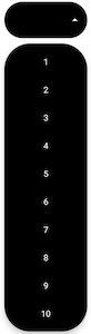
最终结果如下:
版权声明:本文内容由互联网用户自发贡献,该文观点与技术仅代表作者本人。本站仅提供信息存储空间服务,不拥有所有权,不承担相关法律责任。如发现本站有涉嫌侵权/违法违规的内容, 请发送邮件至 dio@foxmail.com 举报,一经查实,本站将立刻删除。
