

如何解决在 Vue JS 中创建卡片滑块
我正在尝试使用 Vue JS 创建卡片滑块,我查看了各种 npm 包 Vue Carousel 3D、Vue Slick,但从未找到适合我的示例的滑块,我的卡片滑块看起来像这样
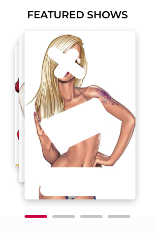
如你所见,图片中有3张图片,第一张在前,第二张和第三张,当你按下按钮时,第一张图片应该向后,后面一张应该向前。
我在网上找了很长时间的合适的例子,甚至使用纯JavaScript,但一直没有找到,如果你能帮我做点什么,我将不胜感激。
index.html
<div class="first_block">
    <h2>FEATURED SHOWS</h2>
    <div class="girls_gard_container">
      <img class="card_1" src="https://images.unsplash.com/photo-1503023345310-bd7c1de61c7d?ixid=MXwxMjA3fdb8MHxzZWFyY2h8MXx8aHVtYW58ZW58MHx8MHw%3D&ixlib=rb-1.2.1&w=1000&q=80" alt="Girl">
      <img class="card_2" src="https://images.unsplash.com/photo-1527455505333-9d3ac7adf523?ixid=MXwxMjA3fdb8MHxzZWFyY2h8OXx8Zml2ZXxlbnwwfHwwfA%3D%3D&ixlib=rb-1.2.1&w=1000&q=80" alt="Girl">
      <img class="card_3" src="https://images.unsplash.com/photo-1597976618063-810eb50c84fb?ixid=MXwxMjA3fdb8MHxzZWFyY2h8NHx8dGFtfGVufdb8fdb8&ixlib=rb-1.2.1&w=1000&q=80" alt="Girl">
    </div>
</div>
style.css
.first_block {
    padding: 0px 23px 0px 23px;
    margin: 5px;
  }

  .circle-wrap {
    margin: 0px 5px 0px 5px;
  }

  .third_block div h2 {
    font-size: 20px;
    font-family: Montserrat-Medium;
  }

  .first_block {
    width: 30%;
  }

  .first_block h2,.second_block h2 {
    font-family: Montserrat-Medium;
    margin-bottom: 0.3rem;
  }

  .first_block h2 {
    text-align: center;
    font-size: 20px;
  }

  .girls_gard_container {
    position: relative;
    bottom: 15px;
  }

  .card_1 {
    position: absolute;
    max-width: 100%;
    top: 70px;
    width: 100px;
    height: 238px;
  }

  .card_2 {
    position: absolute;
    max-width: 100%;
    top: 44px;
    left: 15px;
    width: 126.24px;
    height: 287px;
  }

  .card_3 {
    position: absolute;
    max-width: 100%;
    top: 20px;
    left: 25px;
    width: 240px;
    height: 331px;
  }
解决方法
使用您已经创建的样式,您可以自行循环。我很确定下面的例子是丑陋的,有一种更清洁更好的方法来做到这一点,但作为一个例子:
<template>
  <div>
    <div class="first_block">
      <button v-on:click="moveToNextCard()">Next</button>

      <h2>FEATURED SHOWS</h2>
      <div class="girls_gard_container">
        <img
          class="card_1"
          :src="cards[index % cards.length].img_url"
          alt="Girl"
        />
        <img
          class="card_2"
          :src="cards[(index + 1) % cards.length].img_url"
          alt="Girl"
        />
        <img
          class="card_3"
          :src="cards[(index + 2) % cards.length].img_url"
          alt="Girl"
        />
      </div>
    </div>
  </div>
</template>

<script>
export default {
  props: {
    msg: String,},data() {
    return {
      index: 0,cards: [
        {
          id: 1,img_url:
            "https://images.unsplash.com/photo-1503023345310-bd7c1de61c7d?ixid=MXwxMjA3fDB8MHxzZWFyY2h8MXx8aHVtYW58ZW58MHx8MHw%3D&ixlib=rb-1.2.1&w=1000&q=80",{
          id: 2,img_url:
            "https://images.unsplash.com/photo-1527455505333-9d3ac7adf523?ixid=MXwxMjA3fDB8MHxzZWFyY2h8OXx8Zml2ZXxlbnwwfHwwfA%3D%3D&ixlib=rb-1.2.1&w=1000&q=80",{
          id: 3,img_url:
            "https://images.unsplash.com/photo-1597976618063-810eb50c84fb?ixid=MXwxMjA3fDB8MHxzZWFyY2h8NHx8dGFtfGVufDB8fDB8&ixlib=rb-1.2.1&w=1000&q=80",],};
  },methods: {
    moveToNextCard() {
      this.index = (this.index + 1) % this.cards.length;
    },};
</script>

<!-- Add "scoped" attribute to limit CSS to this component only -->
<style scoped>
.first_block {
  padding: 0px 23px 0px 23px;
  margin: 5px;
}

.circle-wrap {
  margin: 0px 5px 0px 5px;
}

.third_block div h2 {
  font-size: 20px;
  font-family: Montserrat-Medium;
}

.first_block {
  width: 30%;
}

.first_block h2,.second_block h2 {
  font-family: Montserrat-Medium;
  margin-bottom: 0.3rem;
}

.first_block h2 {
  text-align: center;
  font-size: 20px;
}

.girls_gard_container {
  position: relative;
  bottom: 15px;
}

.card_1 {
  position: absolute;
  max-width: 100%;
  top: 70px;
  width: 100px;
  height: 238px;
}

.card_2 {
  position: absolute;
  max-width: 100%;
  top: 44px;
  left: 15px;
  width: 126.24px;
  height: 287px;
}

.card_3 {
  position: absolute;
  max-width: 100%;
  top: 20px;
  left: 25px;
  width: 240px;
  height: 331px;
}
</style>
版权声明:本文内容由互联网用户自发贡献,该文观点与技术仅代表作者本人。本站仅提供信息存储空间服务,不拥有所有权,不承担相关法律责任。如发现本站有涉嫌侵权/违法违规的内容, 请发送邮件至 dio@foxmail.com 举报,一经查实,本站将立刻删除。
