

如何解决自定义 CSS 聊天气泡
我使用 CSS 创建了一个聊天气泡。但是我没有得到我想要的输出。这是我的代码,
body{
background-color: lightgreen;
}
.bubble {
margin: 100px;
display: inline-block;
position: relative;
width: 300px;
height: auto;
background-color: white;
}
.border{
border: 2px solid red;
}
.border-radius{
border-radius: 10px;
-webkit-border-radius: 10px;
-moz-border-radius: 10px;
}
.triangle-right.border.right-top:before {
content: ' ';
position: absolute;
width: 0;
height: 0;
left: auto;
right: -26px;
top: -2px;
bottom: auto;
border: 25px solid;
border-color: red transparent transparent transparent;
}
.triangle-right.right-top:after{
content: ' ';
position: absolute;
width: 0;
height: 0;
left: auto;
right: -22px;
top: -0.3px;
bottom: auto;
border: 25px solid;
border-color: white transparent transparent transparent;
}
.chat{
padding: 6px;
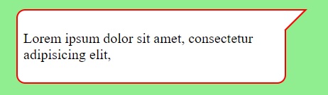
}<div class="bubble triangle-right border-radius border right-top">
<div class="chat">
<p>Lorem ipsum dolor sit amet,consectetur adipisicing elit,</p>
</div>
</div>我得到的输出:
我想要的输出:
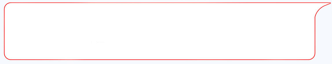
如何获得第二张图片中的输出。我想在右上角获得类似曲线的效果(就像在第二张图片中一样)。谢谢。
解决方法
您可以尝试使用 radial-gradient() 来绘制曲线:
可能的例子
body{
  background-color: lightgreen;
}

.bubble {
  margin: 100px;
  display: inline-block;
  position: relative;
  width: 300px;
  height: auto;
  background-color: white;
}
.border{
  border: 2px solid red;
}
.border-radius{
  border-radius: 10px;
  -webkit-border-radius: 10px;
  -moz-border-radius: 10px;

}

.triangle-right.right-top:before{
  content: ' ';
  position: absolute;
  border-top:2px red solid;
  width:6px;
  top:-2px;
  right:0;
  height:10px;
  background:white;
}
.triangle-right.right-top:after{
  content: ' ';
  position: absolute;
  width: 30px;
  height: 40px;
  left: auto;
  right: -30px;
  top: -2px;
  background:radial-gradient(ellipse at bottom right,transparent 28px,red 29px,red 30px,white 31px);
  border-top:solid red 2px;
}
.chat{
  padding: 6px;
}
<div class="bubble triangle-right border-radius border right-top">
<div class="chat">
<p>Lorem ipsum dolor sit amet,consectetur adipisicing elit,</p>
</div>
</div>根据您的需要调整尺寸和位置。
版权声明:本文内容由互联网用户自发贡献,该文观点与技术仅代表作者本人。本站仅提供信息存储空间服务,不拥有所有权,不承担相关法律责任。如发现本站有涉嫌侵权/违法违规的内容, 请发送邮件至 dio@foxmail.com 举报,一经查实,本站将立刻删除。
