
如何解决如何将 div 与父 div 对齐?
假设我们有 4 次潜水。 第一个 div 是外部 div。 我想创建一个 HTML 第二个 div 大小首先是 50% 并且在第一个 div 的中间底部。 第三个 div 大小为 50% 秒,位于第二个 div 的中间左侧。 第四个 div 大小为第三个 div 的 50%,并位于第三个 div 的中间顶部。
我该怎么做?
解决方法
这是您想要的输出吗?它是使用 position、top 和 bottom 以及 translate 制作的,以确保其居中正确。
.div1 div { /* makes every small div 50% the size of the previous */
    width: 50%;
    height: 50%;
}
.div1 {
    width: 200px;
    height: 200px;
    background-color: red;
}
.div2 {
    background-color: green;
    position: relative;
    top: 100%;
    left: 50%;
    transform: translate(-50%,-100%);
}
.div3 {
    background-color: pink;
    position: relative;
    top: 50%;
    transform: translate(0,-50%);
}
.div4 {
    background-color: lightblue;
    position: relative;
    left: 50%;
    transform: translate(-50%,0);
}
<div class="div1">
<div class="div2">
<div class="div3">
<div class="div4">
</div>
</div>
</div>
</div>您也可以使用 flex(或网格)和 margin 代替位置:
div {
  display: flex;
}

body>div {
  /* sizing : whatever you want to start from */
  height: 90vmin;
  width: 90vmin;
  background: #ed1c24;
}

div div {
  height: 50%;
  width: 50%;
}

div div {
  background: #22b14c;
  margin: auto auto 0;
}

div div div {
  background: #ffaec9;
  margin: auto auto auto 0;
}

div div div div {
  background: #00a2e8;
  margin: 0 auto auto;
}


/* center the demo */

html {
  display: flex;
  height: 100vh;
}

body {
  margin: auto;
}
<div>
<div>
<div>
<div>
</div>
</div>
</div>
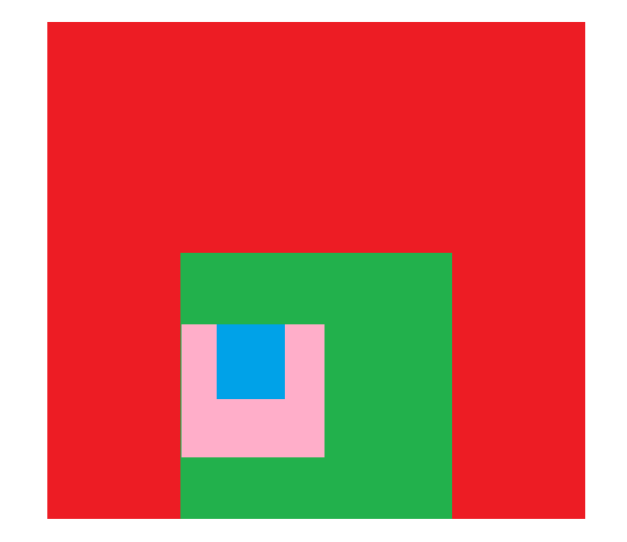
</div>我们可以通过使用 CSS Flexbox 和 Margin 属性来实现这一点。
index.html
<body>
    <div class="firstdiv">
        <div class="seconddiv">
            <div class="thirddiv">
                <div class="fourthdiv">
                </div>
            </div>
        </div>
    </div>
</body>
styles.css
div {
    display: flex;
}

.firstdiv {
  background-color: red;
  width: 600px;
  height: 600px;
}

.seconddiv {
  background-color: green;
  width: 50%;
  height: 50%;
  margin: auto;
  margin-bottom: 0;
}

.thirddiv {
  background-color: pink;
  width: 50%;
  height: 50%;
  margin: auto;
  margin-left: 0;
}

.fourthdiv {
  background-color: blue;
  width: 50%;
  height: 50%;
  margin: auto;
  margin-top: 0;
}
您可以使用下面的 CSS flexbox。下面有四个 div,您可以更改第一个 div 的大小。然后其他人会自动对齐并调整自己的大小。
HTML 文件:
<html>
<body>
  <div id="first">
    <div id="second">
      <div id="third">
        <div id="fourth">
         <p>Text</p>
        </div>
      </div>
    </div>
  </div>
</body>
</html>
CSS 文件:
* {
    margin: 0;
    padding: 0;
}

#first {
    background: #ed1c24;
    width: 500px;
    height: 500px;
    display: flex;
    justify-content: center;
    align-items: flex-end;
    margin: auto;
}

#second {
    display: flex;
    flex-direction: row;
    justify-content: flex-start;
    align-items: center;
    background: #22b14c;
    width: 50%;
    height: 50%;
    margin: 0 auto;
}

#third {
    display: flex;
    flex-direction: row;
    justify-content: center;
    align-items: flex-start;
    background: #ffaec9;
    width: 50%;
    height: 50%;
}

#fourth {
    display: flex;
    justify-content: center;
    align-items: center;
    background: #00a3e9;
    width: 50%;
    height: 50%;
}
点击查看这几行代码的结果: Result
版权声明:本文内容由互联网用户自发贡献,该文观点与技术仅代表作者本人。本站仅提供信息存储空间服务,不拥有所有权,不承担相关法律责任。如发现本站有涉嫌侵权/违法违规的内容, 请发送邮件至 dio@foxmail.com 举报,一经查实,本站将立刻删除。