

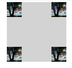
但由于某种原因,它只填充元素的四个角:
我的代码:
.wrap {
  width: 400px;
  height: 300px;
  margin: 50px auto;
  position: relative;
}

.item {
  width: 100px;
  height: 100px;
  background-color: lightGray;
  border: 50px solid transparent;
  border-image: url(http://lorempixel.com/50/50/) 50 50 50 50 stretch stretch;
}
<div class="wrap">
  <div class="item"></div>
</div>
我错了什么?
我希望小图像在水平方向上垂直重复.
因此灰色框用图像模式包围.
任何帮助非常感谢.
解决方法
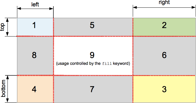
border-image-slice的工作方式是UA将根据切片中指示的偏移将图像分割成9个部分.在您的情况下,一旦您将图像切片50px,中间没有任何内容可以设置为下图中标记为5,6,7和8的区域(图像从MDN复制).
从W3C Spec on border-image-slice:
The regions given by the ‘border-image-slice’ values may overlap. However if the sum of the right and left widths is equal to or greater than the width of the image,the images for the top and bottom edge and the middle part are empty,which has the same effect as if a nonempty transparent image had been specified for those parts. Analogously for the top and bottom values.
您必须将border-image-slice设置为小于25的区域,以便中间区域覆盖图像.
注意:虽然规格说顶部和底部边缘图像也被认为是空的,但我不确定为什么浏览器会在所有四个角上显示图像.这可能取决于浏览器的实现.即使我们将border-image-slice指定为25,加上浏览器也似乎工作正常.它与规范略有矛盾,但你至少得到了理由:)
版权声明:本文内容由互联网用户自发贡献,该文观点与技术仅代表作者本人。本站仅提供信息存储空间服务,不拥有所有权,不承担相关法律责任。如发现本站有涉嫌侵权/违法违规的内容, 请发送邮件至 dio@foxmail.com 举报,一经查实,本站将立刻删除。

