
有没有办法在React Native中使用flexbox来实现Masonry / Pinterest样式列?
在React Native中,远程图像在加载时不会调整大小(请参阅“
Why not automatically resize everything”).这似乎限制了使用flexbox,因为默认情况下远程图像的大小为0x0,如果设置宽度或高度,它们不会像在Web上那样保持宽高比.
幸运的是,在this github pull request中进行了大量讨论,这导致了@paramaggarwal的一些出色工作,以生成如下所示的代码:
<View aspectRatio={1}>
  <View style={{flexDirection: 'row',flex: 1}}>
    <Image
      style={{flex: 1}}
      source={{uri: "http://edibleapple.com/wp-content/uploads/2009/11/steve-jobs-bill-gates-1991.jpg"}}
    />
    <Image
      style={{flex: 2}}
      source={{uri: "http://edibleapple.com/wp-content/uploads/2009/11/steve-jobs-bill-gates-1991.jpg"}}
    />
  </View>
  <View style={{flexDirection: 'row',flex: 1}}>
    <Image
      style={{flex: 3}}
      source={{uri: "http://edibleapple.com/wp-content/uploads/2009/11/steve-jobs-bill-gates-1991.jpg"}}
    />
    <Image
      style={{flex: 2}}
      source={{uri: "http://edibleapple.com/wp-content/uploads/2009/11/steve-jobs-bill-gates-1991.jpg"}}
    />
  </View>
</View>
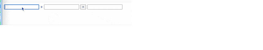
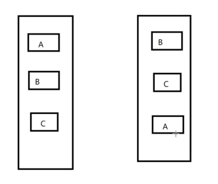
并启用这样的布局:
虽然这不完全是您需要的布局,但我非常确定此更改将允许flexbox以更像“网络”的方式用于图像.根据github的说法,PR已准备好在昨天(7月3日)合并,所以希望它不会太长,直到我们在发布中看到它.
版权声明:本文内容由互联网用户自发贡献,该文观点与技术仅代表作者本人。本站仅提供信息存储空间服务,不拥有所有权,不承担相关法律责任。如发现本站有涉嫌侵权/违法违规的内容, 请发送邮件至 dio@foxmail.com 举报,一经查实,本站将立刻删除。